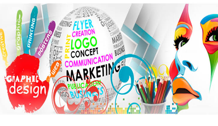
An image or graphical representation is simply an image displayed on a computer screen. Thus, computer graphics are simply images displayed on screen. Graphics are often contrasted with text, which is composed of characters such as numbers and letters.
Two-dimensional computer graphics are referred to as two-dimensional graphics. Early computers could only display two-dimensional black-and-white or black-and-green images. Later, computers began to display color images. In contrast to the first computers, which supported only 16 or 256 colors, the majority of computers now display graphics in millions of colors.
A two-dimensional graphic can be either raster or vector. Raster graphics are most commonly used in digital photos, Web graphics, icons, and other types of images, since they are composed of a simple grid of pixels. While vector graphics are made up of paths, which can be lines, shapes, letters, or other scalable objects, they are often used in logos, signs, and other types of artwork. Vector graphics are scalable, unlike raster graphics, so they can be made larger without losing quality.
In the 1990s, 3D graphics became popular along with 3D rendering software, such as CAD and 3D animation programs. By 2000, many video games were incorporating 3D graphics because computers had enough processing power to operate them. These days most computers come with a 3D video card that takes care of all the 3D processing. This allows even basic home systems to play advanced video games and run advanced applications in 3D.
The main types of graphic design are print and web, which we will discuss below.
Despite the similarities between print and web design, there are some key differences that most people (both inside and outside the industry) do not understand. From methods of working and file formats to tools and terminology, the following guide explains some of the most important (and often confusing) differences between the two disciplines.
1. print design:
The term print design includes any design where the final form is intended to be printed, In today’s world of digital design tools, it’s likely that the actual designing will be done on a computer or even on the web itself, however the final product will be printed, This includes items such as brochures, flyers, shopping bags, stickers, labels, book covers, posters, business cards – even t-shirts!
2. web design:
Web design encompasses more than just the graphics on a website; it includes the user experience, usability, and accessibility of that site. The web design is intended for use on computers, mobile devices, and other gadgets, with a web connection. Now that we’ve established our definitions, it’s time to discuss the key differences between print and web design.
Differences Between Web and Print Design
The experience of interacting with a print design, such as a magazine, is different from using a website. The experience of interacting with a print design is about moving through information linearly, turning each page and letting your eyes follow the information. There may be a chance that you stumble upon an article you weren’t expecting to read, which has pros and cons, depending on your objective. If you are looking for specific information quickly, this might not be an advantage, but on the other hand, you may discover something you weren’t expecting, and that turns out to be useful or enjoyable – serendipity versus personalization, you might say.
Many websites function differently than they used to, they are all about clicking and scrolling, and the placement of relevant content in an ever-increasing personalized format now seems to be the norm.
Ever clicked on an article and at the bottom it says ‘why not try these’? Or ‘Learn more about’? There are other places to click on, but these links are usually at the bottom of articles, guiding you to other topics within the article. This keeps you focused on a narrow topic that may be relevant, but doesn’t provide much room for exploration.
Print or screen
Fixed:
To start with, let’s talk about a thing that is obvious, Print design is all about creating something that will look good on some form of printed media, a fixed size that will not budge.The closed nature of the industry also makes mistakes more likely, such as making an error when a mistake gets sent to print and 10,000 brochures or magazines are delivered with mistakes.
No second chances – check twice, print once! Websites offer the advantage of modifying content after it’s been published when compared to printed magazines.
Fluid:
The key to web design is making it work on multiple screens. Thinking about this throughout the design process is a radical change, especially in recent years as Responsive Web Design (RWD) or Adaptive Web Design (AWD) has become the standard approach.The idea of RWD was probably first introduced in an article by Ethan Marcotte titled ‘Responsive Web Design’ for A List Apart back in 2010. Today, it seems this practice is common place, since websites often operate as a living, breathing medium, providing a constant stream of information to users on multiple devices.
Colours:
Whenever you build a design, colour is one of the most important components, and the colour schemes used for print design and web design are totally different. It’s all about ink and light.
CMYK:
As a rule of thumb, print-based designs use a colour model called CMYK, which refers to the four colors used in most colour printing: Blue, Magenta, Yellow, and Black. You can manipulate the outcome using a variety of factors, including the type of printing press, the operator, or even the type of paper, not to mention the finishing options you can apply!
RGB:
The RGB color model is used by computers and mobile phones to display colors, consisting of Red, Green, and Blue. The different lights are added together to produce various hues. Similar to print, there are variables – you are dependent on the level of color calibration on whatever screen you’re viewing a website on.
If we need examples, then perhaps we should examine the interconnect/it logo, or more specifically, how the color red appears? The printed version of the logo is created by mixing the following four inks: C0/M95/Y100/K0. The percentages represent the amount of ink mixed together to achieve the exact colour red we want.
In the example above, the primary red colour was originally Pantone 485C, which is another colour matching system used in print design and often used as a starting point for creating a foundation colour.
The colour values used on our website are: R222 B19 G1, where RGB values are usually in the range of 0-255, as you can see, the colour values represent the values. Hex codes, or to give the full name, hexadecimal codes, are another method for representing colors when designing and building websites. In our case, we would use #DE1301 for the interconnect/it red.
Typography
Compared to web designers, print designers have the advantage of being able to choose from a significantly larger selection of fonts, but the gap has gotten smaller in recent years, especially with the availability of web font embedding services. It is great that Google has many free fonts, but if you’re looking for a wider selection, you can use other paid services, like Typekit for example.
There is another inconsistency with web fonts, which is that they can look different across different devices, platforms, and browsers. Generally, there isn’t too much to worry about, but fonts render differently on different systems, such as Windows and OSX.
Conclusion
There is definitely a different set of technical skills and knowledge needed, and being proficient in InDesign is of no advantage when you need to understand HTML and CSS.
Whether it’s a print or web project, it’s about creating well-thought-out, considered designs. The exact processes and technical knowledge may be different, but the overall focus is on delivering elegant solutions that resolve specific design challenges.
